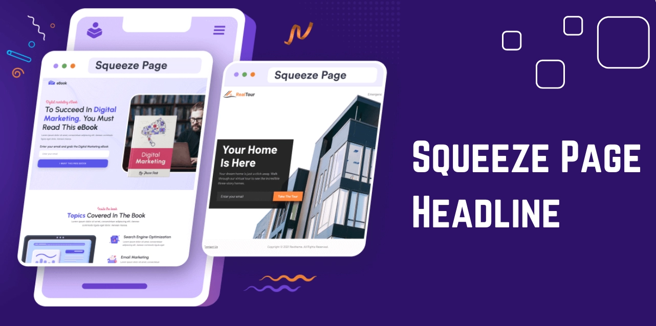
Grabbing and holding your audience’s attention is a real challenge in the crowded digital landscape. This is where you can have a look at well-designed squeeze page examples that can make all the difference. These specialized masterfully crafted landing pages capture visitors’ email addresses and convert them into valuable leads.
A great squeeze page combines eye-catching design, persuasive copy, and an irresistible call to action to maximize conversions. This blog aims to showcase some of the most effective examples, of how to create those and essential tips. We will also highlight what makes them stand out.
By examining these top-notch squeeze page examples, you will understand how to create a high-performing squeeze page that drives results and elevates your marketing strategy. So, what are you waiting for? Let’s get started!!
Listen To The Podcast Now!
What Is A Squeeze Page?
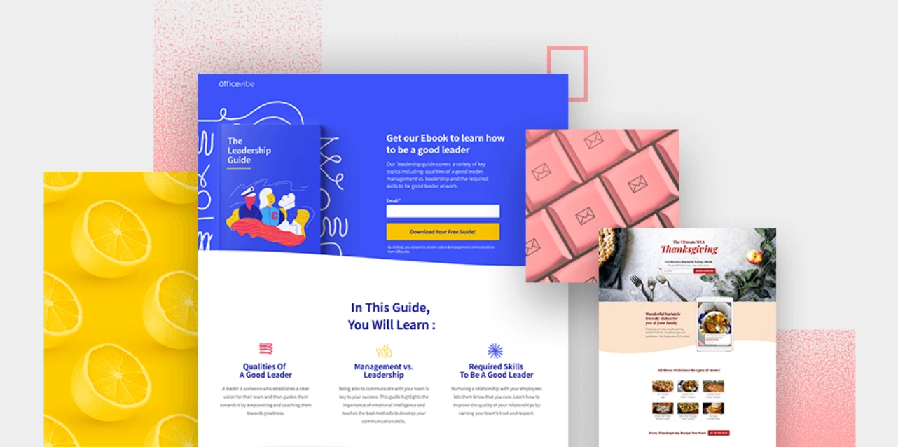
A squeeze page is a landing page designed to capture a visitor’s contact information, most commonly their email address. The primary goal of a squeeze page is to “squeeze” the visitor into providing their contact details by focusing their attention on a single call-to-action, such as signing up for a newsletter, downloading a free resource, or accessing exclusive content.
It is achieved by minimizing distractions and emphasizing the signup form or call-to-action button. Squeeze pages are a core component in building an email list and nurturing potential leads and often serve as the entry point in a huge marketing funnel. We are going to show you some squeeze page examples to enhance lead generation in your business. But before that, you should know-
What Does A Squeeze Page Include?
Now that you understand the meaning of a squeeze page, you’re ready to design one that effectively captures information from potential leads visiting your website.
Creating a high-converting squeeze page involves trial and error, as what works for one website or industry might not work for another. However, the best squeeze pages share five common elements that engage visitors and drive conversions.
A Strong Headline
The headline is the first thing visitors see and must capture their attention within seconds. It should clearly state the main offer, such as a free toolkit, downloadable content, or discount codes. Take reference from squeeze page examples to understand better.
Use urgent and compelling language to encourage immediate action. Powerful words like “now” and “free” can make visitors feel they should act quickly to take advantage of the offer.
A Convincing Description
Beneath the headline, provide a short, detailed explanation of your offer. This is your chance to elaborate on what visitors will get in return for their email address when they will receive it, and how it will benefit them. Use convincing language and incorporate numbers or statistics to add credibility.
Photos, Videos, or Screenshots
Incorporate visual elements to cater to different learning styles and enhance engagement. Videos, photos, and screenshots can explain your offer more effectively and build trust.
For example, the B-School program uses an image of Marie Forleo to connect with visitors who already recognize her, making the page more relatable and trustworthy.
A Well-Designed Form
The form is the most crucial part of your squeeze page. Before creating one, analyze other squeeze page examples. Keep it simple by only asking for essential information, such as the visitor’s first name and email address. While additional fields like job titles or company URLs can provide valuable data, they can also reduce conversions.
Research shows that fewer form fields can increase conversion rates by over 120%, so avoid overwhelming visitors with too many requests.
A Call-to-Action Button
A clear and compelling call-to-action (CTA) button tells visitors exactly what to do next. The button should be more than just a bland directive; it should convey the value of the offer engagingly. Transform standard verbs into enticing one-liners that motivate action.
For example, “Download” can become “Grab my free eBook,” and “Sign-up” can become “Get 14 days free.” Fisher Investments’ squeeze page examples demonstrate how a well-crafted CTA can significantly impact.
By incorporating these five elements and considering various squeeze page templates into your squeeze page, you can create an engaging, high-converting tool that effectively captures leads and drives your marketing efforts forward.
How Is Squeeze Page Different From Landing Page?
Wondering about the difference between a squeeze page and a WordPress landing page? Let’s make it clear
Purpose
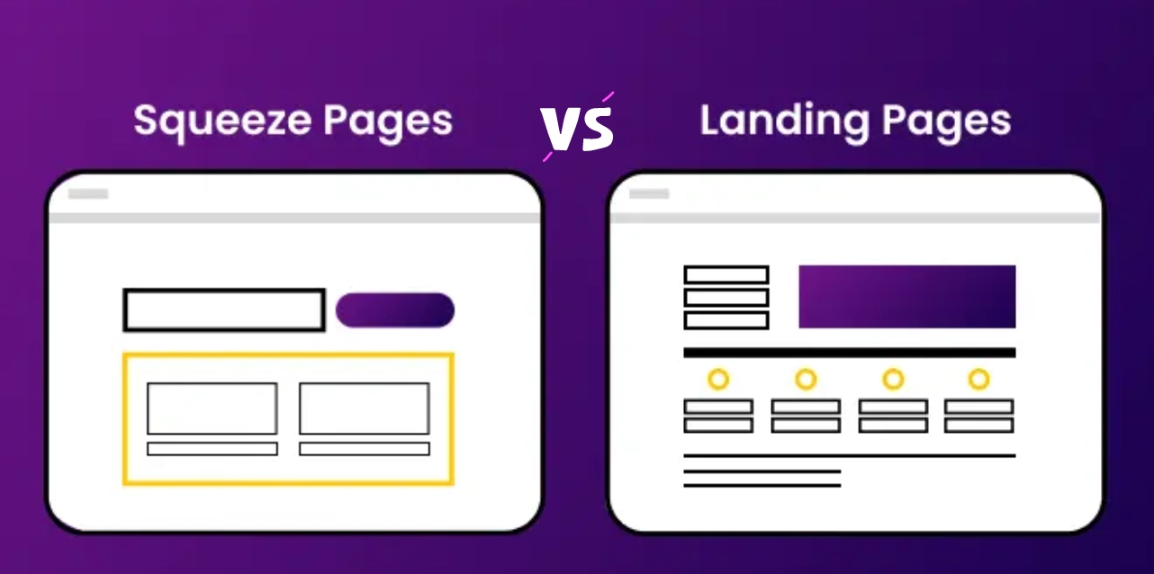
Squeeze Page: The primary goal is to capture a visitor’s email address. It’s designed to focus visitors’ attention on a single call-to-action, such as signing up for a newsletter or downloading a free resource.
Landing Page: Serves a variety of goals, including generating leads, driving sales, promoting events, or facilitating other user interactions like taking a quiz or survey.
Design
Squeeze Page: Many squeeze page examples feature a minimalist design with few distractions. It typically has a single call-to-action to ensure visitors focus solely on providing their email addresses.
Landing Page: This can be more complex, containing various elements such as images, multiple calls-to-action, and links. This design accommodates its broader objectives.
Success Metrics
Squeeze Page: Success is measured by the number of email addresses collected. The singular focus is on growing the email list.
Landing Page: Success is measured by plenty of user interactions, such as sign-ups, sales, downloads, or other conversions, depending on the page’s specific goals.
Usage Context
Squeeze Page: Ideal for scenarios where the primary objective is lead generation through email collection. Squeeze page examples are commonly used in targeted marketing campaigns, including paid ads, where maximizing conversion rates is critical.
Landing Page: Suitable for multiple purposes beyond just lead generation. It can support product launches, event registrations, content distribution, and more.
While both squeeze pages and landing pages are essential tools in digital marketing, they serve distinct purposes. Understanding these differences can help you choose the right tool for your specific marketing needs.
Best Squeeze Page Examples
Here are the best examples:
GQ
GQ is a renowned men’s lifestyle magazine known for its high-quality content and coverage of fashion, culture, and lifestyle trends.
What they did well:
- Utilized a recognizable celebrity image (Zach Galifianakis) to enhance credibility and association with influential personalities.
- It implemented a succinct opt-in form, requesting only an email address, minimizing user effort.
- The CTA button color effectively contrasts with the page background, enhancing visibility and clickability.
Areas for improvement:
- The headline and image alignment could better convey a clear benefit to the user, enhancing the value proposition.
- The sub-headline could offer a firm and more specific value proposition tailored to GQ’s brand authority.
- Refining the CTA button copy to align with GQ’s mission and evoke user action more effectively would enhance conversion rates.
MarketingSherpa
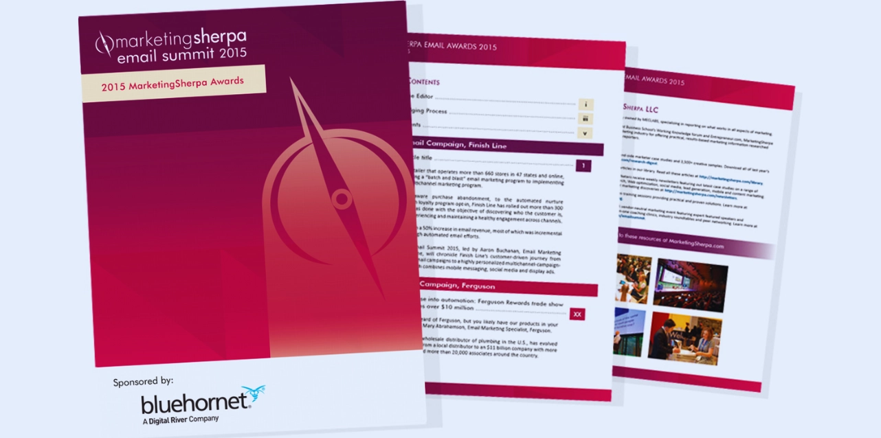
MarketingSherpa,’s squeeze page examples are leading providers of marketing research, case studies, and practical guidance for marketers.
What they did well:
- Leveraged social proof in the headline, inviting users to join thousands of weekly readers, enhancing credibility.
- Provided benefit-focused copy, clearly articulating the value proposition for subscribers.
Areas for improvement:
- You can eliminate redundancy in the copy between the headline and sub-headline for a more concise and impactful message.
- The inclusion of a “No thanks” link may inadvertently encourage users to exit the squeeze page prematurely, potentially reducing conversion rates.
- The “About us” link might distract users from the primary goal of subscribing, and its removal could streamline the user experience.
Smart Insights
Smart Insights offers actionable insights and resources for digital marketers to optimize their strategies and drive business growth.
What they did well:
- Emphasized the word “free” prominently, attracting users with an enticing offer.
- Incorporated company badges to establish credibility and trust among visitors.
- Utilized concise form fields, requesting only an email address for streamlined opt-in.
Areas for improvement:
- The CTA copy could be more compelling and action-oriented to prompt immediate engagement.
- The offer’s specificity enhances the provider’s clearer benefits and value propositions for users.
Forbes
Forbes is a globally recognized media company providing insightful business news, analysis, and expert commentary.
What they did well
- Employed persuasive language such as “Exclusive” and “Premium” to entice users to subscribe.
- Adopted first-person language in the CTA button, creating a sense of personalization and urgency.
- Delivered concise yet informative content, ensuring clarity on the value proposition for subscribers.
Areas for improvement
- Social share buttons may be more appropriately placed on the “Thank You” page or within the content rather than on the squeeze page itself.
- Outdated copyright information could undermine the perception of the content’s relevance and currency.
NetApp
NetApp is a leading cloud data services provider offering innovative data management and storage solutions.
What they did well:
- It crafted a benefit-oriented headline, clearly communicating the value proposition of downloading the offered content.
- NetApp provided succinct yet informative copy, outlining the content’s key benefits and what users can expect.
- It implemented a streamlined opt-in form, minimizing friction by requesting only essential information.
Areas for improvement:
- The CTA button could be enhanced with a more compelling and action-oriented copy to drive higher click-through rates.
High-Converting Squeeze Page Tips
Crafting a high-converting squeeze page involves more than just ticking off a checklist of essential elements. Despite all the basics, your design may still be underperforming. Here are five key strategies to elevate your squeeze page game:
Opt for Professional Design
Invest in professionally designed squeeze pages to instill trust and credibility in your audience. Ensure your pages follow web design and WordPress development best practices, such as mobile responsiveness and consistent branding, to maximize engagement.
Focus on One Clear Offer
Avoid overwhelming visitors with too many choices. Present a single, compelling offer—whether it’s an eBook, webinar, or email subscription—to streamline the conversion process and boost clarity.
Harness the Power of Social Proof
Integrate social proof elements like testimonials, ratings, or recent sign-up notifications to build credibility and reassure potential leads. Leverage real-life examples to showcase the value of your offer and encourage conversions.
Conduct Split Tests
Experiment with diverse variations of your squeeze page elements, including headlines, descriptions, and calls to action. Conduct split tests to identify the most effective combinations and refine your approach.
Prioritize Macro-Optimizations
Start by testing broader aspects like offers and audience segments to ensure alignment with your target market. Once you’ve identified winning combinations, focus on fine-tuning specific elements for further optimization.
You can create squeeze pages that capture leads and drive meaningful conversions by implementing these strategies and refining your approach based on data-driven insights.
However, with the dynamic shifts, many businesses prefer WordPress squeeze page plugins for their squeeze pages. One of the best outsourcing WordPress development services is from Passion8Press.
Passion8Press offers a comprehensive suite of services centered around WordPress development, catering to businesses seeking to establish a strong online presence. From initial concept to execution, Passion8Press specializes in creating dynamic websites that captivate and engage visitors, leaving a lasting impact. With a focus on user-centric design, Passion8Press ensures that every website meets the specific needs of each client, ultimately driving engagement and conversion rates.
Moreover, Passion8Press goes beyond basic website development by offering specialized services such as e-commerce solutions, WordPress plugin development, and theme customization. With an emphasis on speed optimization, Passion8Press ensures that websites load swiftly, providing visitors with a seamless browsing experience.
Additionally, Passion8Press provides round-the-clock website editing services and fully managed security solutions, allowing clients to focus on their business while their online assets are maintained and protected.
Read More
8 Best WordPress Landing Page Themes
Top 7 WordPress Development Best Practices To Make Your Website Shine
How To Make A Squeeze Page?
Creating a high-converting squeeze page involves incorporating key elements and following best practices. Below are six essential steps to help you design an effective squeeze page, with some squeeze page examples for inspiration.
Make an Offer They Can Not Refuse
The most crucial element of your squeeze page is the offer, a lead magnet or signup incentive. This freebie entices visitors to provide their contact details. Common examples include eBooks, spreadsheets, and email courses.
Choose a lead magnet that resonates with your target audience and campaign goals. For instance, one squeeze page uses a link and demo video as the lead magnet, showcasing a clear value proposition.
Start with a Powerful Headline
Your headline is critical as it must capture attention instantly. It should highlight the main benefit or address a pain point, convincing visitors to stay and engage. For example, here is one of the most converting squeeze page examples that emphasizes the immediate value of the offer right from the start, encouraging users to read further or fill out the form.
Write Convincing Copy
Effective copywriting is essential for turning visitors into leads. Your supporting copy should communicate the offer value and encourage immediate action. Emphasize the benefits and minimize perceived risks, by reassuring users with compelling copy.
Use Social Proof
Sometimes, marketing copy alone isn’t enough. Social proof, such as customer quotes, testimonials, and case studies, can boost credibility and conversions for a better squeeze page.
Here is one such squeeze page examples where Ahrefs showcases YouTube comments about their blogging course, and SEO Blueprint highlights customer feedback and scarcity to increase appeal.
Add Trust and Authority Elements
Including trust signals and authority elements can help alleviate any remaining doubts. Display endorsements from reputable brands, certifications, or well-known influencers.
For example, Transferwise uses mentions from FCA, Bloomberg, and Financial Times to build trust, while Brian Dean showcases his authority in the industry to collect more email signups.
Cut Down the Deadweight
Squeeze pages should be focused and free of distractions. Remove or minimize any elements that could divert attention from the primary goal of collecting email addresses. Ensure that everything on the page directs visitors toward completing the signup form.
By following these six steps and incorporating these essential elements, you can create a squeeze page that effectively captures leads and boosts your marketing efforts.
Wrapping Up
Examining various squeeze page examples illuminates the diverse strategies employed by businesses to capture leads effectively. Each example demonstrates the importance of clarity, compelling copy, and persuasive design elements in driving conversions.
By dissecting these pages, we gain valuable insights into what works and what doesn’t in the realm of lead generation. Moreover, the diverse industries represented, from media to marketing, showcase the versatility of squeeze pages in different contexts.
As businesses strive to optimize their online presence, learn from these examples and hire WordPress developers to guide you in crafting high-converting squeeze pages tailored to their specific audience and goals. Ultimately, by leveraging the best practices observed in these examples, businesses can enhance their lead-generation efforts and cultivate meaningful connections with their target audience.


